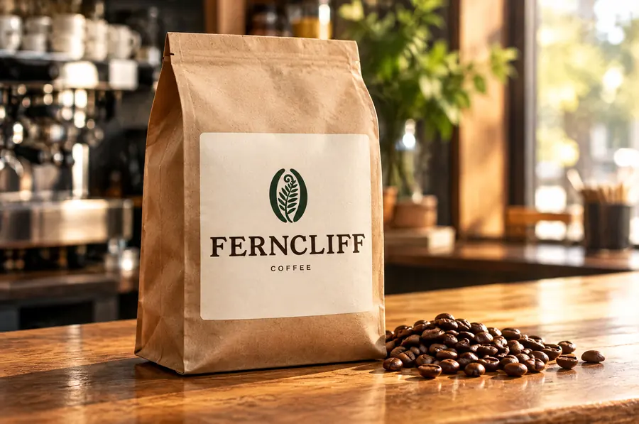
Ferncliff Coffee: coffee bag

Ferncliff Coffee

Coffee roasteryBristol, United Kingdom

01

Brand identity

A neighbourhood roastery and cafe in Bristol that roasts every Tuesday and wants you to taste the difference.

Personality

WarmCraftyUnfussy

Audience

Bristol locals, remote workers and home brewers who buy beans by the bag.

Direction

Forest green and copper like an old shop front, a characterful serif, kraft paper everywhere.

Logo system

FERNCLIFFCOFFEE
Primary logo
FERNCLIFFCOFFEE
Secondary logo
Icon
FERNCLIFFCOFFEE
Reversed
FERNCLIFFCOFFEE
On accent

Colour palette

Tap a colour to copy its HEX code.

Typography

Aa
Young SerifHeadings · weight 400

ABCDEFGHIJKLM
abcdefghijklm 0123456789

Aa
Work SansBody · weight 400

Every Tuesday the roaster goes on at 7. By Wednesday morning those beans are in your cup, or in a bag on your kitchen shelf. That's the whole idea.

  1. Roasted on Tuesdays. Drunk by Wednesday.
  2. Small batches from our roastery in St Werburghs.
  3. Ferncliff Coffee · Bristol

Visual identity

A repeating bean-and-frond pattern for bags and cups, copper rules, stamp-style roast date boxes.

Photography

Ferncliff Coffee photography direction

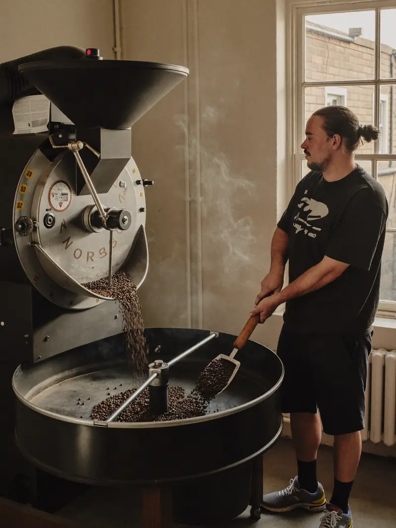
Behind the counter and at the roaster. Warm tungsten and window light, steam, hands, real mess.

Tone of voice

Friendly regular behind the counter. A bit dry, always about the coffee.

  • Roasted on Tuesdays. Drunk by Wednesday.
  • New beans from Huila. Tastes like red apple and brown sugar.

Usage

FERNCLIFFCOFFEExx

Stacked lockup on bags and cups, horizontal on signage. Clear space of one bean height. Never place copper text on forest.

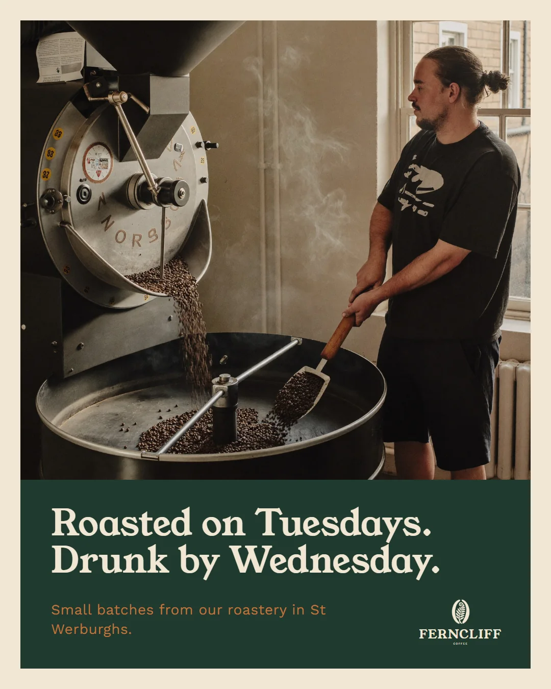
Social rules. Cream frame around every photo like a printed card. Serif headline on a forest band.

02

Social media

Ferncliff Coffee Instagram post: Roasted on Tuesdays. Drunk by Wednesday.
Brand storytelling · Instagram feed post

Every Tuesday the roaster goes on at 7. By Wednesday morning those beans are in your cup, or in a bag on your kitchen shelf. That's the whole idea.

Cream frame around every photo like a printed card. Serif headline on a forest band.
03

The conversation

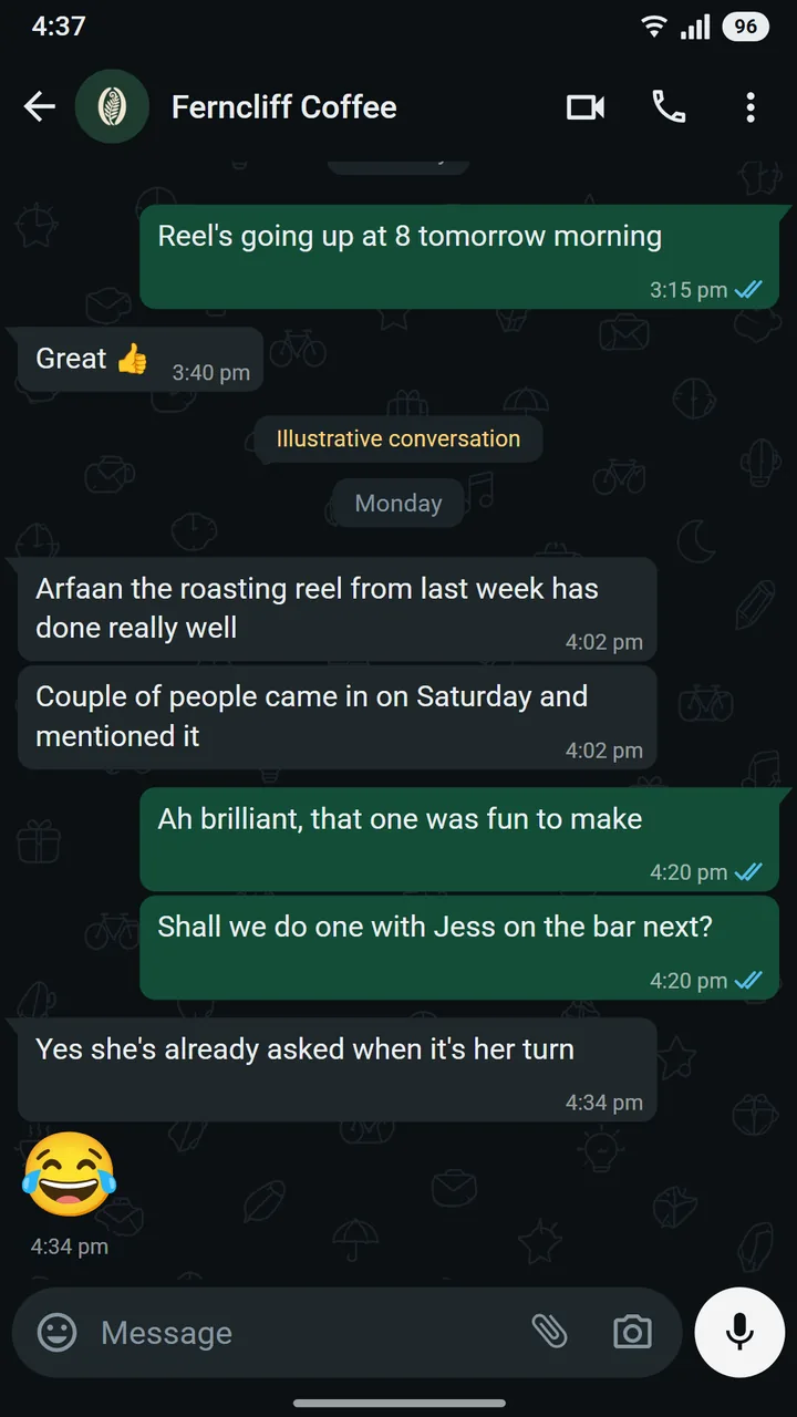
WhatsApp conversation between Tom Avery of Ferncliff Coffee and Arfaan at Asteroid

What working together sounds like from the owner's side: Tom Avery, co-owner at Ferncliff Coffee, messaging Arfaan on the Asteroid team.

04

Project overview

The challenge
Great coffee, a forgettable logo, and bags that looked supermarket-generic on the shelf.
Brand direction
An old Bristol shop front feeling: forest green, copper, a serif with character.
Creative approach
A fern-in-bean mark that reads at stamp size, a stacked wordmark for bags and cups, and a pattern for everything else.
Design decisions
Kraft and cream do the heavy lifting so the green feels premium, not loud.
Services shown
  • Brand identity
  • Packaging
  • Social media design